
I followed my son and purchased a Kobo Libra Colour to replace my ageing Kindle Oasis and I have been more than impressed by what it offers. I should mention that it isn’t a small device although for some reason it looks tiny in the above photo, a photographic illusion that got me +1,000 upvotes on Reddit and a huge number of comments calling me Shrek etc🤣
What I have noticed is how well built the device is, how comfortable it is in the hand and how it gives that special sense that you only get with few products. It feels completely natural and just gets on with the job whether you put effort in or not.

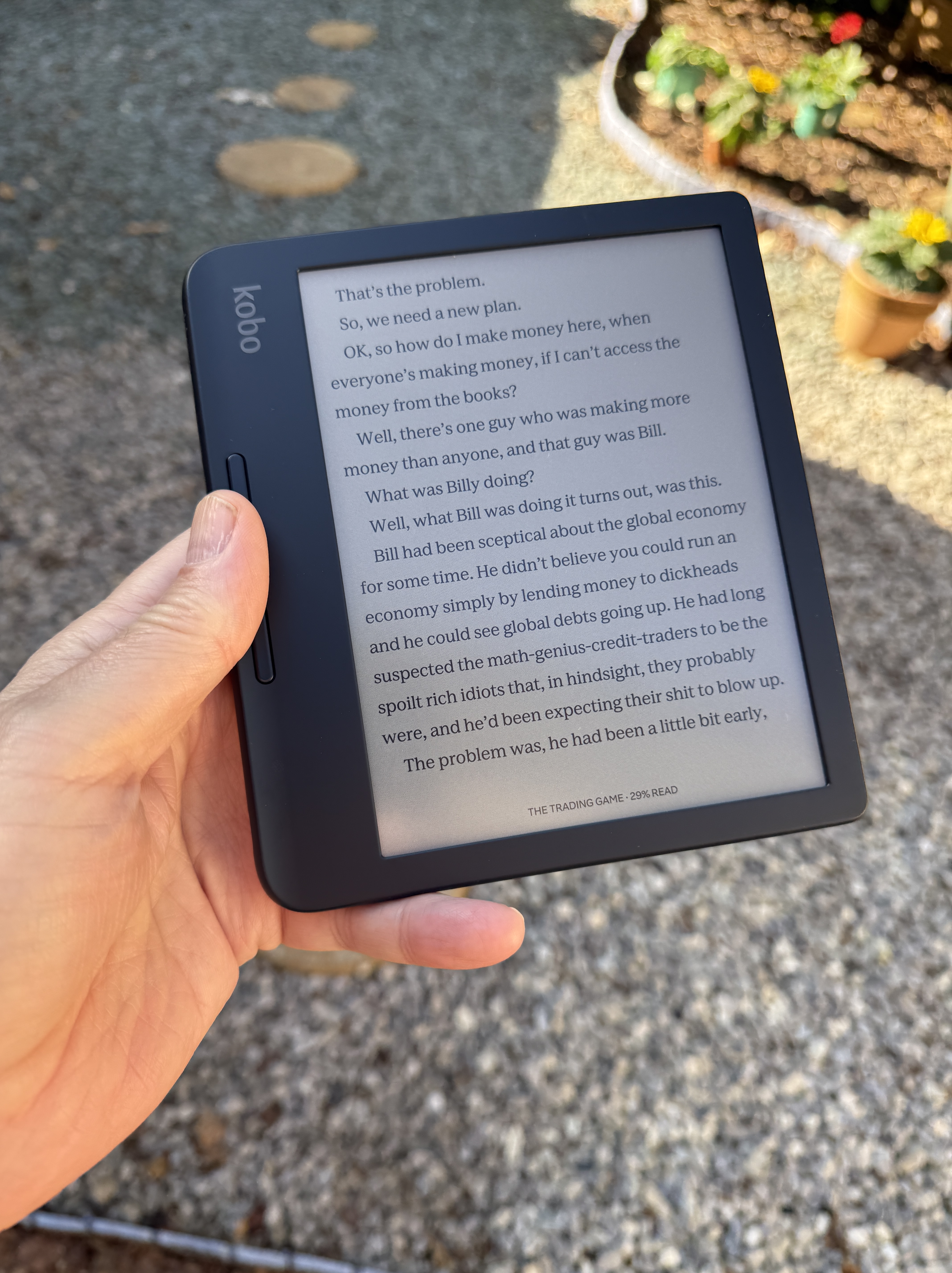
From the colourful packaging to the quick setup process, the sense that this is human designed is apparent at every stage. The screen is somewhat greyer than a Kindle when reading an eBook, but this is made up for by the use of colour which adds a lot to your handwritten notes and when reading comics and articles with included imagery.
You can read eBooks from the Kobo store, download and read PDFs, save and read articles via the Pocket app, borrow books from your local library and do more with this competitively priced offering.

Marking up eBooks and documents is easy and here is a tip for you to save some money. The official Kobo stylus is expensive, but you can use the Metapen and pay approx £30 to get virtually the same experience, including being able to attach it to the side of the Kobo magnetically.

I don’t have much more to say. My Oasis was 6 years old so was showing serious signs of age. The newer Kindles are decent, but they have not fundamentally changed over the years and the Kobo looks and feels much more considered, better built and much better value.
Categories: Books, Product Reviews

Very nice! I’m tempted.
LikeLike