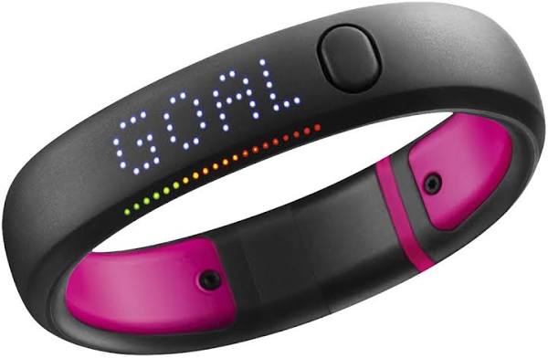
I owned a Nike+ FuelBand many years ago, but did not use it for long. The technology was in its very early stages and I vaguely remember thinking that it did not offer much, but that is understandable. We are talking about 2012!
Look at the design above and consider all of the trackers that have followed. Not one has come close to the simplicity and clever integration of a screen as the FuelBand.
There is a market, I am convinced, that wants fitness tracking in a design that does not look like a fitness tracker and 13 years later we are still awaiting one that fulfils that wish.
Well done Nike for the design, shame on you for how you treated your customers when it was discontinued, but it still remains a positive experience which will live long in my memory.
Categories: Design, Fitness, Fitness Trackers

Leave a Reply