
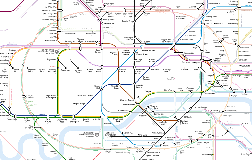
Visual hierarchy implemented with the lines, tube lines (most frequent) in bold solid colour, other TFL services (less frequent) in a pastel shade with darker border, National Rail services (least frequent) as hollow lines. This draws the attention of the eye towards the busier services and subconsciously suggests the most regular option… More here.
It took a long time, but Luke has managed to greatly improve the map with the most subtle of changes.
Categories: Design

Leave a Reply